Tuesday, September 29, 2015
Molds
I didn't take a picture of my mold when we did it because it was unsuccessful, and I didn't realize I would need a picture of it. I attempted to recreate the banana bowl, but when peeling the clay off of the bowl it all fell apart. If I had taken a picture it just would've been a picture of a big pile of pieces of clay, which is not very exciting. I think that the mold process is something that could end up being really cool for a piece, and it is something that I would be willing to try again in the future, but it definitely didn't work out for this project. I should've put something in between the bowl and the clay, but I didn't remember that step until I had already put the clay on the bowl. While the clay was on the bowl it looked like it was going to turn out really well, but the moment I started trying to take it off of the bowl it began falling apart. The mold process seemed to work well for other people, so it is definitely something that I would be willing to try again.
Monday, September 28, 2015
Vessel Mini Lesson (Pit Fired Piece)


To create my pit fired piece I started out with a clay base, and then made a coil of clay that slowly wrapped its way up forming the sides of the little container. I smoothed it out some so that the coil isn't quite as obvious. The container isn't very big, so I'm not sure what I will use it for yet. To prep it for the fire I took some of the copper and wrapped it around the top of the piece after it had been through everything that Mrs. Sudkamp had to do herself. Then I added a bunch of different kinds of leaves around my piece until I felt I had covered it enough. Lastly I wrapped it up in the tin foil. The finished product turned out pretty cool, and I really like how you can see where the copper burned away on my piece. I thought that this style of work was very unique and different, and it is something I would be willing to do again. I am debating using it for my main vessel project, but I am not sure that pit fired is the look I am going for with that piece. Either way I really like this method and the final product it creates.
Wednesday, September 23, 2015
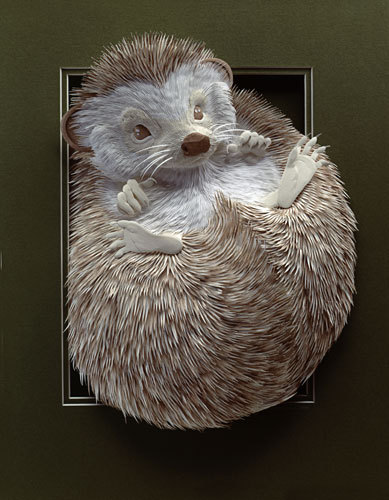
Relief Main Piece

Wednesday, September 2, 2015
Mini Projects- Relief
Clay Relief:

This is my clay relief tile. I think that this is probably Mr. Sands' favorite relief project that I did because it is a Zonkey. I think that it turned out really well and I am proud of my effort to make his favorite animal (or at least I am assuming that this is his favorite). The one thing that I found challenging was getting the clay out in the tight spaces, like around his nose and whatever you wanna call the two squares at the top, otherwise I thought this one was fairly easy. This one is probably my favorite of the mini projects because I feel like it is the one I worked the hardest on.
Cardboard Relief:

This is my cardboard relief tile. It is supposed to be a panda if you can't tell, and this is another one I am very proud of just because I think it turned out to be much better than I expected. The only thing that I found challenging about this was making sure I was only cutting through and peeling off the layers that I wanted to take off. The only thing that I wish could have turned out a little better was the panda's mouth. I ended up just making it a straight line, but I feel like it isn't noticeable enough.
Paper Relief:

This my paper relief (sorry that the picture didn't turn out very good, I was in a hurry to get it since class was almost over). This one is my least favorite because I didn't like working with the paper. It doesn't have layers that I could carve out or peel away like with the cardboard or clay, so it was harder for me to come up with what to do for this one. I would say that this is definitely abstract, and it turned out sort of how I envisioned it would.
Tuesday, September 1, 2015
Inspired Artist


Monday, August 31, 2015
Styrogami

I feel that my styrogami piece was somewhat successful. The first time I tried to do this it didn't go very well and I ended up scrapping it for this one (partially because Grayson thought he could "fix" it which turned out to mean break it). This cup was supposed to show a spiral effect, and if I could change anything about it I would try to make the toothpicks a little less noticeable. Also I would try and make the spiral not quite as thick so that there would be more spirals going around throughout the whole cup. This picture, in my opinion, makes the cup look much better than it did when you were looking at it in real life. While my cup wasn't by any means the prettiest or the most creative I still think it was a success because I am happy with how it turned out (and it didn't break like the last one did).
Wednesday, May 27, 2015
Final Exam Blog Post
ART INSPIRING TECHNOLOGY

This piece was one of my favorites because of how cute it is, and it shows art that inspired technology. I used art to draw the seal, cut it into pieces, and color it. I used technology to take pictures of the seal in different positions, and I used the computer to make the seal appear to be moving in a cycle. The art that I used to create the seal inspired the use of technology to try and make the seal move. I thought that the seal was too cute to just be a simple drawing of a seal, so I wanted to make it move with the use of technology.
TECHNOLOGY INSPIRING ART

In this piece I used technology to make art. I used technology to take all of the individual pictures of Kara, the jump rope. the sport court, the USA Jump Rope logo, the frames, and of me. Then through photoshop to cut Kara and I out of our pictures, change the color of the inside of our frames, and in general just piece the picture together. In the end it created art that was nothing like any of the individual pictures. Kara and I are on different jump rope teams and using technology I was able to create art that showed the battle that we go through at competitions.
PERSONAL CRITIQUE: WE COLLABORATE

This project was one that was worked on by a big group of students from our class. If I remember right it was Kara, Megan, Ashley, Grayson, Chris, Caitlin, and I. We collaborated a lot to create this dog. We were all constantly asking each other to back up and look at the dog to make sure that it looked right because we all wanted the dog to turn out really good. Kara drew the dog in her sketchbook and inspired us to draw it on the street. She helped us figure out the size to make the dog so it would stay proportional to the size it was when she drew it. Without Kara we wouldn't have even had the idea to create the dog on the street. We all worked together really well and the end result turned out to be very close to the original.
SUCCESS
This project was my most successful because I actually managed to make Carter's stick arms look like they are my arms. I didn't think that this picture was going to work out nearly as well as it did, and I am very happy with it. I solved problems because I had to clone my hair to make it where my arms used to be because my arms were in a slightly different position than his were. I also had to blend our skin tones to make it look more realistic. I developed my art skills because before this project I had never been able to successfully use the clone tool on anything, and after I was able to use it to make it look like I actually have hair where I don't.
DO OVER

If I had to choose one project from this year to do again it would have to be the light art. It sort of worked, but right as we were finally starting to get it class ended. If we were to redo this I would want to make the room even darker because everything we did had a red light in it because the red paper was too thin. Also since we would already know how to do the light art from last time so we would hopefully be able to get much better pictures this time. We could even try some completely different designs with the light from what we did before.
Subscribe to:
Posts (Atom)